


We would like to introduce our achievements of TDS.
We have more that is not uploaded on our website, so if you are interested to see our works,
please feel free to contact us.
- All
- Business design
- Communication design
- Product development
- New technology
-

Matsuwaki Clinic Shinagawa
We created a web site for the opening of the otolaryngology. By creating from both the doctor and patient’s perspective, we designed a site with fulfilling content, accessible and easy to understand, in other words, we thoroughly considered and planned UX (user experience) in this website.
-
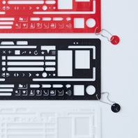
Re+g Web-form Ruler
This is a product of TDS original brand "Re + g (REPLUG)". http://www.replug.jp/ “I want to convey more attractive ideas”. “I want a template that can draw wireframes and storyboards cleanly”.
It is a tool dedicated and developed based on such creators voice observed during the scenes of web production. Distortion and scale deviation is less likely to happen, so you can draw the image beautifully and easily. -
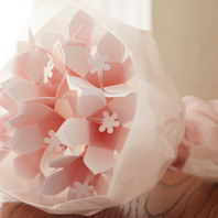
Re+g / Hana-kotoba Kit
This is a product of TDS original brand "Re + g (REPLUG)". http://www.replug.jp/ A three-dimensional message card that turns into a single flower when it folds up. "Hana - kotoba Kit" is a unique flower form message card kit. You can also arrange the form to a necklace or bouquet and enjoy.
All necessary materials for crafting are included in the kit.
You can choose from 3 types according to the use or number of sheets wanted. -
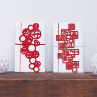
Re+g celebration envelope
This is a product of TDS original brand "Re + g (REPLUG)". http://www.replug.jp/ This celebration envelope was designed to include enough style and play but with sophisticated impression. We arranged the traditional celebration design pattern with modern taste. The design both matches Japanese and western outfit. *Celebration bag is an envelope used for putting gift money given to the new couple during events such as wedding ceremony.
-
Asahi Shinkin Bank – Corporate Image Poster
Poster displayed in Asahi Shinkin Bank storefronts. A series of illustrated posters based on the opinions of bank customers.
-
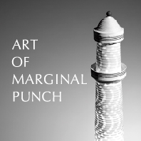
Toppan Forms
As a memorial marking the 50th anniversary of the establishment, we produced the original calendar "ART OF MARGINAL PUNCH".
Reusing the marginal punch part of the business form that is manufactured everyday, we recreated it as an art work and used as the main visual.
We focused meticulously on light and shadow of the photo. -

Web technology
After restructuring their business and expanding overseas, they sought to develop VI aimed at a wider market upon relocation of their company premise. The project would lead to inner branding as part of the corporate reform, making use of the efforts at brand structuring itself.
Key actions to promote brand recognition and presence were performed continuously over 10 years based on the fundamental plans created during the early phases of the project. -
Dai-ichi Frontier Life Insurance Co. Ltd
VI development for a new company aimed at improving customer satisfaction and pursuing further expertise.
After settling on the project's concept and criteria, the brand symbol was selected through careful screening from many designs. -
Anes Co. LTD
Structured the VI for a new company arising from a merger. Held keyman discussions, competition research, and concept creation to effectively and constantly convey the new company's identity.
Visual communication elements could be visualized by categorizing them as visual language or verbal language. -
Herlequin Bis
Established the shop's identity for the opening of this French restaurant in Yugawara.
A brand concept was formulated through careful demographic targeting, competition analysis, and local research. Based on the concept, we conceived every touchpoint to spread the visual and verbal language across various devices. -
Yanmar co. LTD
Created the VI for their corporate museum which was founded as part of their 100th year anniversary. Developed the brand by following the steps: 1. Prepare, 2. Know, 3. Judge, 4. Perceive, 5. Deploy and Operate.
We extracted brand factors, and debated/defined the ideal form from its history of 100 years to visualize the VI and structure the system. -

Sugano Dental Clinic
VI development for the opening of the clinic. Produced the clinic's sign, business cards, and all necessary tools for the opening of the business in a full package. Both quality and cost were achieved in the creative development.
-
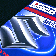
Suzuki Motor Corporation
Standardized the tone and manner of product packaging of genuine parts for two-wheel and four-wheel vehicles, to protect the brand in overseas markets where brand appeal and imitations are abundant. Created a system that supports six languages (English, French, German, Italian, Spanish, Japanese, and other local languages).
-
Syouei Create Co
Developed and streamlined the VI as an effort in inner branding, where a task team was formed to share opinions and deliberate the company's purpose. Staff members were included in the decision making process. Business cards can be selected from several base designs with different shapes and information, which can be printed separately with variable data.
-
Onoya Inc
Formed a task team to formulate a brand strategy that worked in conjunction with the corporate strategy. Pursued the ideal form of the company and storefront from various angles and methods. Based on this, we developed an integral VI system with visual design and perceived wording.
-

DIGITAL Hearts Co. Ltd.
DIGITAL Hearts official website. The corporate prospectus and official website were both redesigned to have a cohesive appearance.
-

Heiwa Paper Co. Ltd
Customized the Movable Type and created a search feature to make it easier to search through their extensive types of paper. Also added a favorites feature that allows visitors to retain their data using local storage in HTML5.
Please contact us
regarding the details of our works and records.